The best way to visualize data is by simplifying subsets and making educated assumptions based on the information provided. By doing so, one can visualize both trends and predictive analytics in ways that can allow users and clinicians to see how actions from the USPTO can alter and modify trends of cure rates.
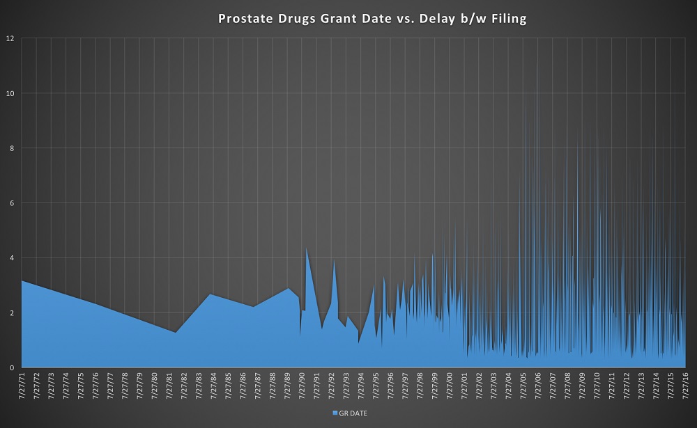
Simplifying subsets of data is always appreciated when visualizing data. In this case, by isolating both the filing date, grant date, time differential between those dates, for certain keyword searches such as ‘malaria’, ‘prostate’, or ‘malignant’, one can break down the data stream into those specific subgroups. The key here is to compare the dates of filing in a simple linear graph as shown in the ‘malaria’ linear excel tab, which is an easy to use graphical interface that shows activity of filing data whereby higher filing activity ends up banding brighter. The data can then be compared to side by side data pulls from the CDC based on upward and downward trends of a disease, where the trends can be displayed in the same manner. If one were to look at the ‘malaria’ tab in the excel file, one can see that a useful visualization mechanism is to graph grant date of patents on the X axis, and the delay between filing and grant on the Y axis. Then display an overlay of the prevalence data from the CDC on top of this graph, showing that the sudden increase in the delay between patent grants was also associated with the increase in disease incidence between the time of 2008-2011. The same can be done for prostate cancers and malignant cancers, by graphing in the same manner as shown in ‘prostate’ and ‘malig’ tabs in the excel file. By using the analysis observed from diseases such as malaria, and setting a learning algorithm that pulls data from the CDC and correlates both the grant date, lag time between filing, and total disease incidence, one can also use the same hypothesis for cancer as well.
This visualization, although simplified in nature, may prove to provide a valuable insight into the total time required to receive a patent grant and the correlation between that time and the incidence of disease both for cancer as well as other disease processes.
References:
- CDC – Malaria Stats: http://www.cdc.gov/mmwr/volumes/65/ss/ss6502a1.htm
Files:
- main submission with data: https://drive.google.com/file/d/0B1RC5JDSj2SEWDYtYmZUa1c2Vzg/view?usp=sharing
- pure visualization only: https://drive.google.com/file/d/0B1RC5JDSj2SEUEh6cTM3Q3M0ek0/view?usp=sharing
- images: https://drive.google.com/file/d/0B1RC5JDSj2SES3c1YzJiWl9EV2s/view?usp=sharing and https://drive.google.com/file/d/0B1RC5JDSj2SEdjk4YVFPYXR5MmM/view?usp=sharing
When you click on any of the above links within the Tableau visualization you will be leaving the United States Patent and Trademark Office (USPTO) Open Data Portal. The USPTO does not necessarily endorse the views expressed or the facts presented on this site. Further, the USPTO does not endorse any commercial products that may be advertised or available on this site. You may wish to review the privacy notice on those sites since their information collection practices may differ from ours.