The USPTO has developed a new dataset to describe patents and patent applications in cancer-related fields, in support of the US Cancer Moonshot. By harnessing the power of patent data, and accelerating the process for protecting the intellectual property that lead to cancer research breakthroughs, the USPTO is standing up and doing its part to help bring potentially life-saving treatments to patients, faster.
The USPTO Cancer Moonshot Patent Data consists of 269,353 patent documents (published patent applications and granted patents) ranging from 1976 to 2016. USPTO is sharing this dataset with researchers and policy makers, so they might gain insight into innovations in cancer-related research and development.
PatentsView is a patent data dissemination platform that uses advanced algorithms to identify inventors and their organizations and locations across 40 years of US patent data. The PatentsView team used the Cancer Moonshot Patent Data to identify a subset of cancer-related granted patents from their database.
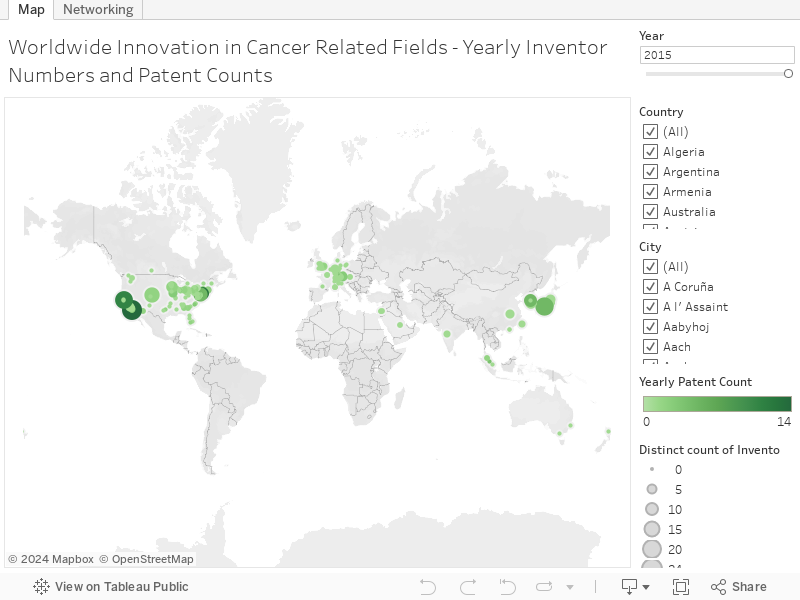
The PatentsView team then developed an interactive map to visualize geographic trends in cancer-related innovations over time. Specifically, the map presents the numbers of inventors and patents in cities worldwide, year by year. It represents 108,923 patents granted between 1976 and 2016 and 127,076 worldwide inventors listed on those patents.
How to Use the Visual:
This is an interactive world map chart implemented in Tableau Public. On the map, each node represents a geographic location (latitude and longitude). The size of a node indicates the number of inventors at that location. The color of a node indicates the number of cancer-related patents those inventors filed in a given year.
Highlighting and Accessing the Data:
Hover over a node to display the country and the city name, the total number of inventors on cancer-related patents at that location, the total number of those patents, and the full name of the inventor with the most cancer-related patents filed in the given year.
To access the data, click on a node, wait for a menu to appear, and click on the “column” icon in the top right. You can view and export the source data about inventors for that location.
Interaction:
You can filter the visualized data by country and city, using the checkboxes to the right of the map. Temporal patterns in patent filings can be visualized by moving the year slider. You can drag and move the map around by selecting the cursor from the tool menu within the map, underneath the zoom in and out buttons. Select a specific zoom area using the lasso tool.
When you click on any of the above links within the Tableau visualization you will be leaving the United States Patent and Trademark Office (USPTO) Open Data Portal. The USPTO does not necessarily endorse the views expressed or the facts presented on this site. Further, the USPTO does not endorse any commercial products that may be advertised or available on this site. You may wish to review the privacy notice on those sites since their information collection practices may differ from ours.